Product / UX Research Intern · WellFit Pay · 2026
Designing Payment Arrangements patients can see.
Nine weeks. An invisible billing process, designed as a product patients and dental offices could see and manage. I was the sole designer: I designed it, tested it before launch, and handed it off.
- Role
- Product / UX Research Intern · sole designer
- Timeline
- 9 weeks · Summer 2026
- Scope
- Research, strategy, product design, testing
- Audience
- CEO, CFO, CPO
Payment arrangements were handshake deals with no cap on terms, and 40–50% of support tickets asked “what do I owe?”
The moment after a financing decline had no owner, not at WellFit and not at any of nine competitors.
Interviewed 9 stakeholders and 3 dental offices, then designed all four end-to-end features myself in 9 weeks.
Tested before launch with 75+ participants, handed off a build-ready spec, and presented the strategy to the CEO, CFO and CPO. The CEO greenlit it for build.
01 / The problem
A payment arrangement is a handshake nobody can see.
It worked financially. It failed as an experience: thin trust, constant miscommunication, no contact before collections.
“They are doing handshake deals and they are not getting paid.”
“Patients are confused because they do not have a good understanding of how many payment arrangements I have, or which are past due.”
“Staff were tracking agreements manually, sometimes on sticky notes.”
02 / Research
Six moves across nine weeks.
Interviews across four teams, a nine-app teardown, two rounds of testing.
- Frame
- Listen
- Map
- Scope
- Test
- Hand off
03 / Discovery
Three gaps. One unowned moment.
The gap: the moment after a financing decline. Nobody owns it.
Why these 4 of 13
13 features made the roadmap. The first four were the ones that closed a gap we had evidence for. The other nine waited.
- No patient dashboard→Patient Status Dashboard
- No repayment signal→Propensity-to-Repay score
- No automated reminders→Automated Reminders
- Staff tracking plans on sticky notes→Office Metrics
04 / Design
Four features, from signal to screen.
Low-fi first, then tightened with staff feedback. Reminders and office metrics share one office-facing view below.
Decline → score → offer
Propensity-to-Repay
A staff-only 1–10 score, banded low / medium / high, used after a financing decline to guide the offer and deposit.
Turns an invisible risk signal into a consistent front-desk decision, without ever exposing the score to patients.
Propensity-to-Repay, after a financing decline
Drag the score · simplified recreation of the staff-only view
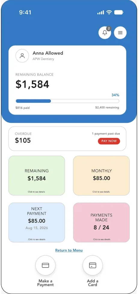
Text link → verify → see balance
Patient Status Dashboard
A no-app, no-login view reached by text message, showing remaining balance, next payment, and full history.
Replaces “what do I owe?” calls with a self-serve moment patients can trust.
Configure → preview → send
Automated Reminders + Office Metrics
Office-facing reminder and escalation settings with previewable message text, a clear on / off control, and a metrics view of every arrangement.
Creates a proactive repayment signal before an account quietly becomes a collections problem.
05 / Decisions
Four calls, and what we chose them over.
Build a payment plan with the new rules
Illustrative · $1,584 balance from the patient dashboard
Term length (capped)
Payment frequency (matches pay schedule)
Before: arrangements stretched to 60 months with no ceiling.
06 / Validation
Pre-launch ratings, strong enough to hand off.
75 unmoderated participants plus live staff sessions, all planned and run by me. No critical accessibility blockers. These are usability ratings from testing, not business results.
Patient self-serve dashboard
“Very easy and user friendly to navigate.”
Propensity-to-Repay usefulness
“Would save time by reducing individual calls.”
Readiness to switch on reminders
“Staff wanted proof that settings actually saved.”
07 / Outcome
Make the handshake visible.
The CEO greenlit it for build. It went forward as a tested direction, with 13 features documented and decisions locked. Launch and post-launch results aren’t covered here. The first thing to measure: does visibility cut “what do I owe?” calls?

08 / Reflection
What I’d carry forward.
Thanks to Karey Crump, Johnathan Tebeau and Paul Little for trusting me with real ideas from day one.