Product Designer · Thrive Education · 2024
Helping older adults say how confident they really feel.
Older adults couldn’t tell their diabetes app how confident they felt. I gave them one simple slider.
- Role
- Solo designer: research, product design, testing
- Timeline
- 2 months · Spring 2024
- Platform
- iOS / Android
- Tools
- Figma, FigJam
The app tracked numbers but couldn’t tell how confident patients felt, so lessons couldn’t adapt.
For older adults, the input had to be effortless and the result explicit: a number and a message, not just a feeling.
As the solo designer, tested four input models, from a pop-up survey to a slider with a number and a message.
25% higher task completion in usability testing with 10 participants.
01 / The problem
Education can’t adapt to confidence it can’t see.
Competitors tracked numbers. None asked how confident patients felt, so lessons couldn’t adapt.
02 / Target audience
Designed for the people most likely to need it.
Built for older adults, where diabetes is most common. Simple enough for anyone.
03 / Research
Clarity mattered more than novelty.
Long-time patients, not tech-savvy, who wanted clearer progress, not more features.
04 / Iteration
Four models, one clear winner.
Paper first
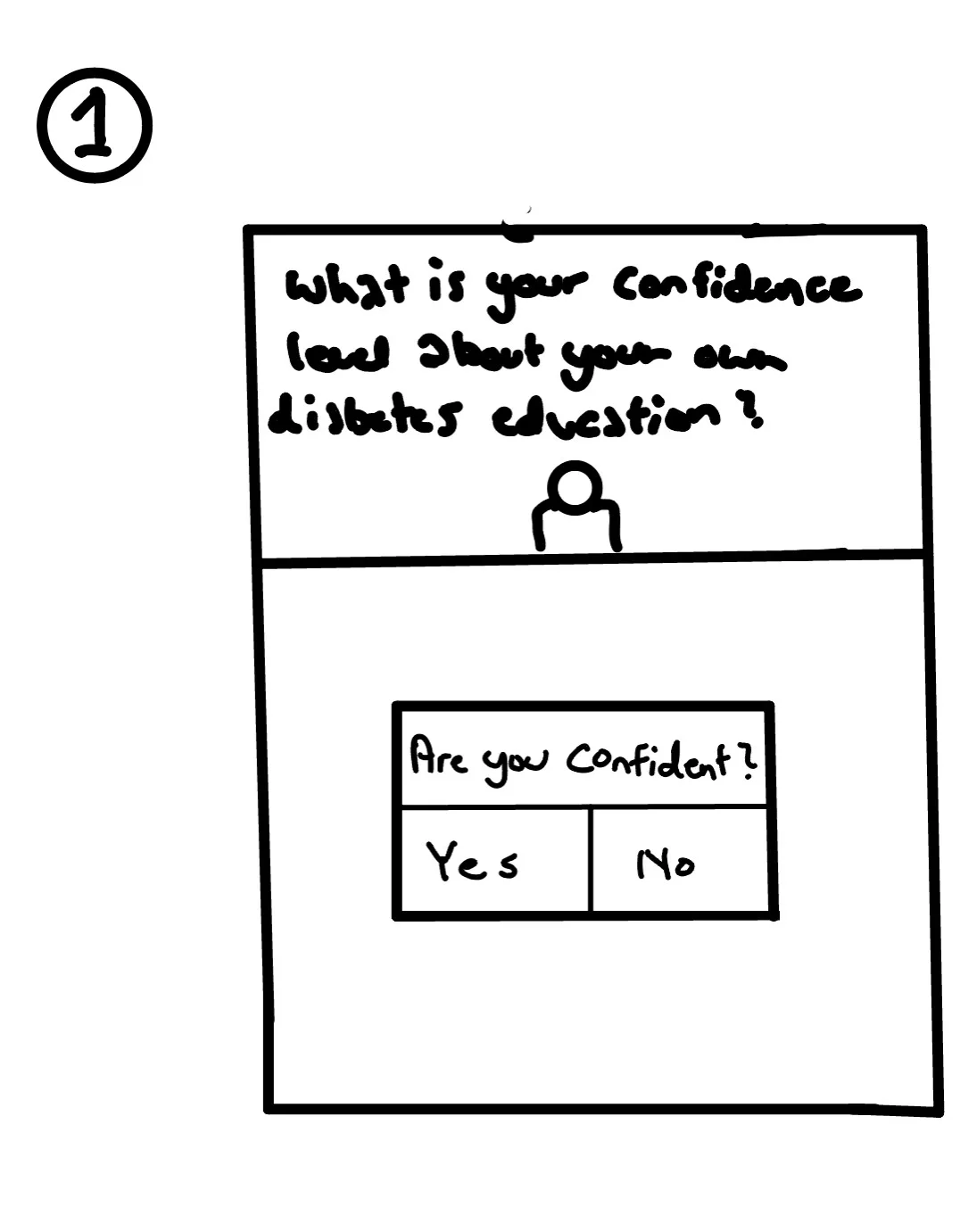
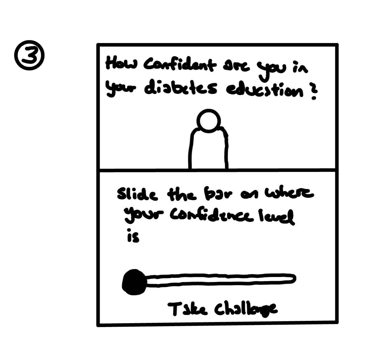
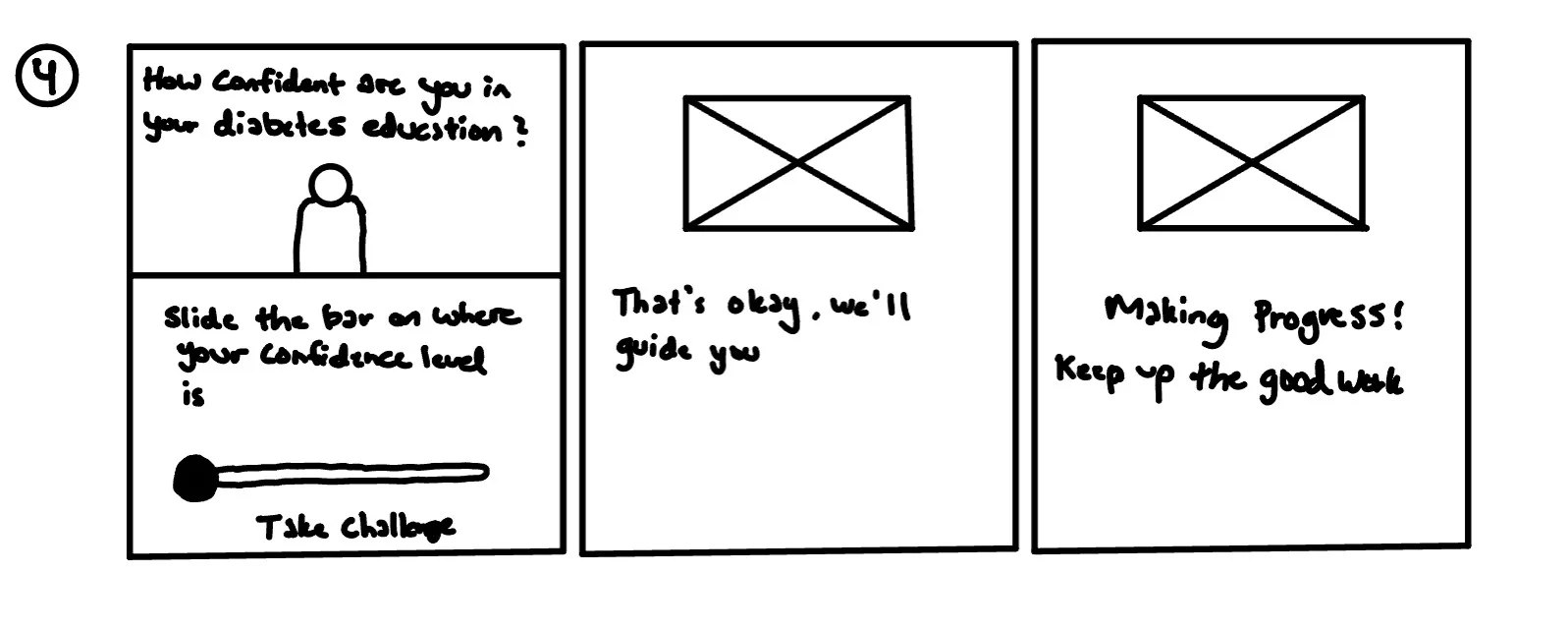
Try every iteration yourself
Pick an iteration · simplified recreations of each prototype
Are you confident?
A quick click worked, but a yes / no answer gave patients no nuance and gave doctors almost nothing to act on.
How do you feel?
The faces added warmth, but the visual language made a health tool feel less credible.
Slide the bar on where your confidence level is
A slider gave users control, but without a number the result was hard to interpret or compare.
What is your confidence level about your own diabetes education?

Slide the bar on where your confidence level is
Drag the bar, then let go

Drag and release: every confidence level leads to its own message and illustration, so patients feel understood and doctors get a read they can trust.
Shipped direction05 / Design
Why the slider won.
Final design
A confidence slider built for older adults
Fine-grained input with a visible number, plain-language labels from “Not Confident” to “Very Confident”, and an illustration that changes with the answer.
Matched the product’s visual language, gave patients and doctors a clearer read, and reduced mis-clicks compared with small tap targets.
06 / Reflection