Product Designer · Done Desk · 2024
Making license renewal a routine, not a scramble.
Dentists tracked their licensing hours by hand. We designed one place to track them, and made renewal a routine.
- Role
- UX research, product design, storytelling
- Timeline
- 4 months · Fall 2024
- My part
- Designed the dashboard, led the research, gave the pitch
- Team
- Krish Parmar, Ava Jiang, Aayushi Prasad
- Tools
- Figma, FigJam
Dentists must log continuing-education hours to renew their license, but there was no tool for it. They tracked hours manually, so gaps showed up at renewal, when it was too late.
People needed status before detail: what’s done, what’s left, and one next step.
I ran 15 interviews and heuristic evaluations, designed the personalized dashboard, and we A/B tested it against a generic one. I pitched the result.
Dentists now have one dashboard for their CE hours instead of tracking them by hand. In A/B testing, users finished tasks faster on the personalized version, and I pitched it to 30+ attendees and 5+ CEOs.
01 / The problem
Miss your hours, lose your license.
Dentists can’t renew their license without enough continuing-education hours, and there was no tool to track them. It was all done manually, so nobody knew what was left until renewal.
02 / Research
Progress needs a visual language.
We studied checklists that make progress obvious at a glance.
03 / Process
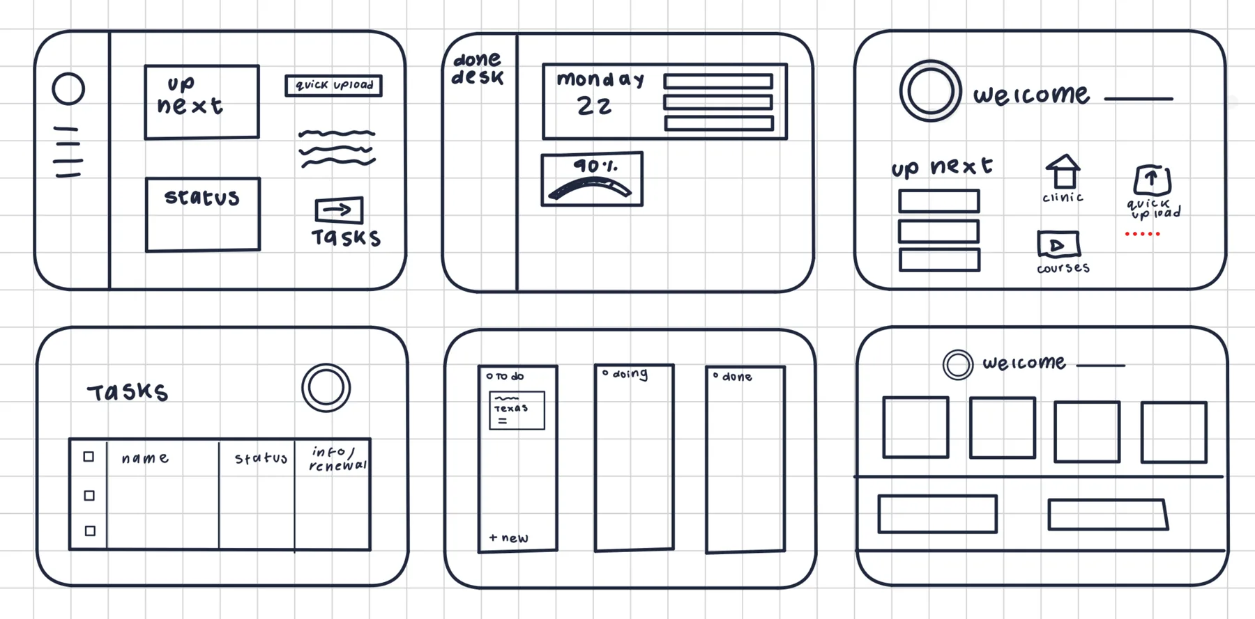
Sketching the right structure.
Rough layouts first: what shows first, what waits, how progress feels tangible.
04 / Design
From empty state to renewal-ready.
Start
A guided first step
A new user sees exactly one action: add a license.
An empty state that points somewhere removes the “where do I start?” moment.
Track
Personalized progress dashboard
Hours completed against the requirement, broken down by category with status for each, so the gap is visible at a glance.
In A/B testing, users finished tasks faster on the personalized dashboard than on a generic one.
Before and after: pen and paper vs. Done Desk
Tick courses off by hand, then upload them in Done Desk · sample data
CE hours — renew by Nov 1!!
Hours Completed
✓ Ready for renewal
05 / Outcome
Shared with the people who’d fund it.
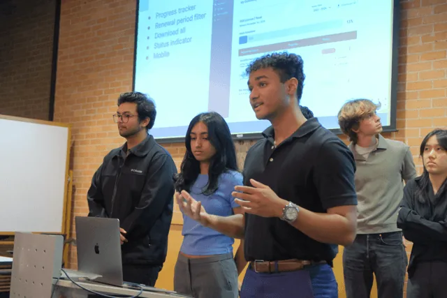
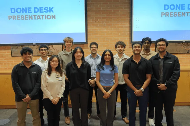
I pitched it to 30+ attendees and 5+ CEOs at a UT Austin showcase.
06 / Reflection